Communicating UI Ideas In Text

Digital designers and developers communicate design ideas to each other every day. The amount of time for rendering and transferring an idea is crucial because we want to fail founded variant as soon as possible.
I use the following rule for any rendering instrument:
The instrument doesn’t matter. But than it is more pliant, than better.
For example, for me, Sketch is the most flexible for checking some ideas from scratch. For ideas based on some existing mockups or pieces — bricolage technique — Photoshop, perhaps, is still a better choice.
But here I want to mention the media we live in all day long. It is a text. We can use it when we think about piece of interface design and want to convey a design idea.
Here is a button, for instance:
[ Apply changes ]
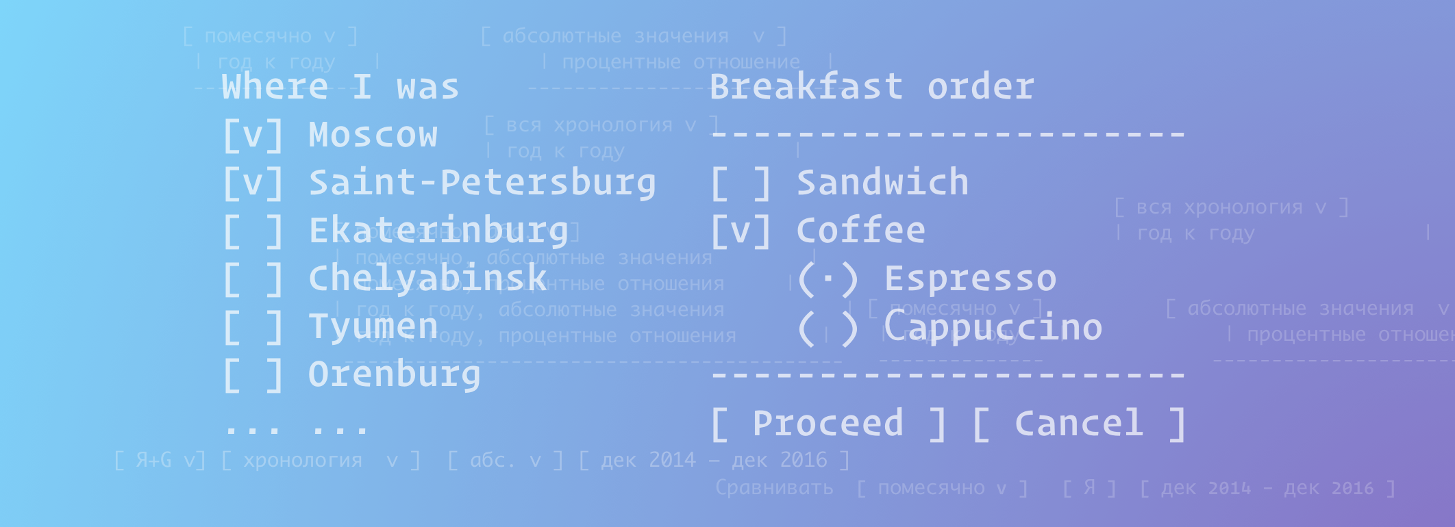
Or a checkbox and radio button list:
[ ] Sandwich
[v] Coffee
    (·) Espresso
    ( ) Сappuccino
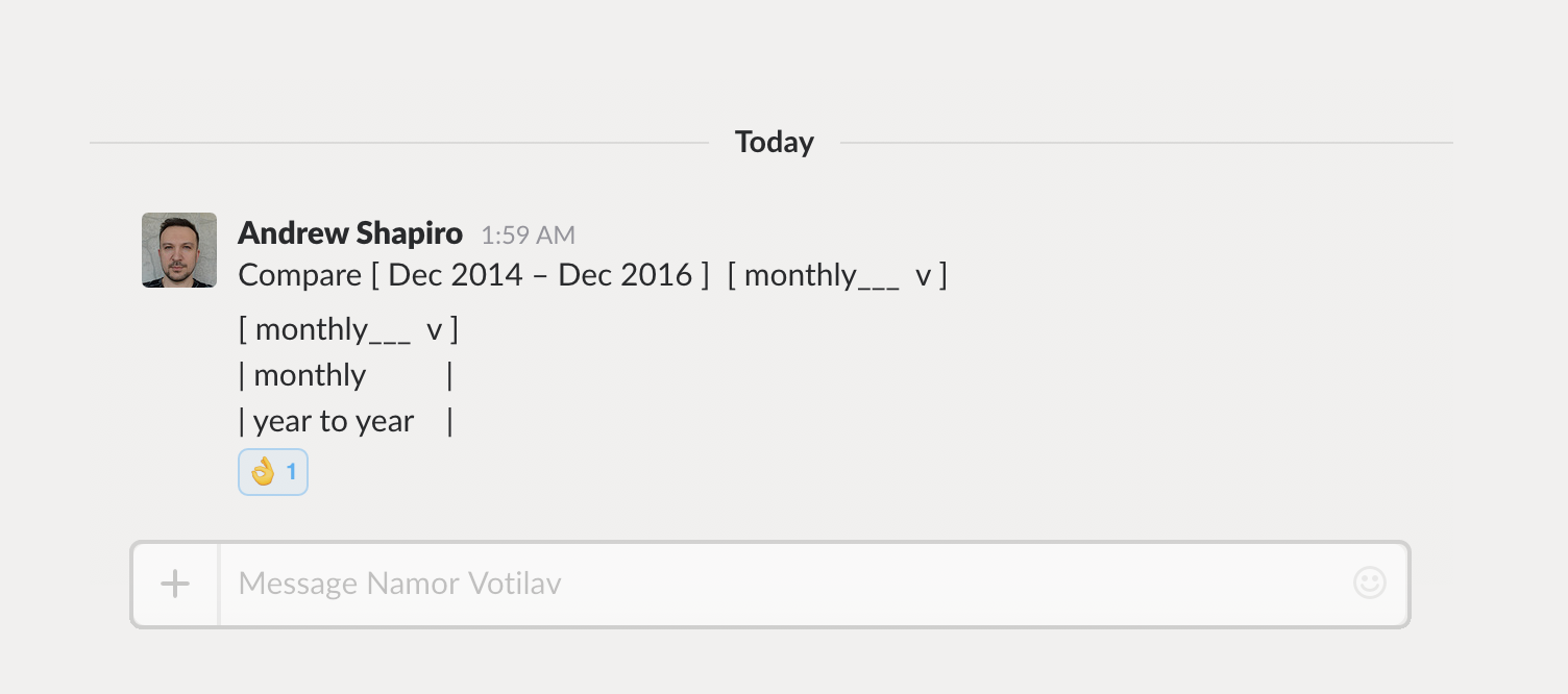
Or dropdown list:
Location:
[ Anywhere ____ v ]
| Anywhere ______ |
| Nearby ________ |
| Last place_____ |
Very simple, very clever. Definitely, a way to convey your thought in seconds.

Text has enough graphic potential. We can decide where to go further with a UI component in a chat in few minutes. There is no big deal. Just another way in your instrumental piggy bank.
